library(factoextra)
library(tidyverse)
library(reshape2)
library(ggplot2)
library(plotly)Data Classification
To do:
Introduction
In this tutorial, we will be applying unsupervised classification techniques to the independent variables in our dataset. The dataset comprises protein pockets characterized by 18 descriptors, which serve as the independent variables. The objective is to evaluate the druggability of those pockets.
Preparing the workspace
Loading libraries
We first load the libraries necessary to our project:
an R package making easy to extract and visualize the output of exploratory multivariate data analyses
a system for declaratively creating graphics, based on The Grammar of Graphics.
Loading data
load("../data/X.Rdata")Data pre-processing
Scaling the data
In classification, scalling the data is a key pre-processing step. A wise choice of the technique must be done depending on the dateset (is it homogeneous or heterogeneous ?). Ensuring the features vary in the same range can improve the performance of the classification of the dataset, as well as better handling the outliers. However if not adapted to the classification, the scalling technique can be detrimental to its performance [1].
Here are two boxplots highlighting how the weight of one feature can dominate the others:
Code
melted_x <- melt(X, variable.name = "Descriptors")
plot_ly(melted_x, x = ~Descriptors, y = ~value, type = "box")
Warning
Be careful scale() returns a matrix with one column for the row names, one for the column names and one for the values. Workarounds could be a transformation into a data.frame or the column targetting.
Code
scaled_x <- scale(X)
scaled_mlt_x <- melt(as.data.frame(scaled_x), variable.name = "Descriptors")
plot_ly(scaled_mlt_x, x = ~Descriptors, y = ~value, type = "box")
Computing the distance matrix
We performed a distance-wise classification between each pocket of our dataset. We used the base R dist() function to do so which uses the Euclidian distance metric by default. As our dataset is contstitued of continuous variables with scaled numerical values. It is the most commonly used metric as it is very intuitive and easily interpretable.
Code
# Computation of the distance matrix
mat_dist <- dist(scaled_x, method = "euclidian")
Hierarchical classification
This non-supervised technique is used to organize and categorize data into a hierarchical structure. The principle behind it is the creation of a system of nested categories. Organizing data in such way makes data easier to read, navigate and understand. It is an easy and fast way to get familiar with an unknown dataset.
Clustering the data
The clustering is performed using the base R hclust() function which agglomerates our datased based on the distance dissimilarity. The default method complete linkage uses the longest distance between objects of a cluster, which produce well defined contours for the generated clusters but not necessarily compact repartition inside the cluster. Here we will prefer the Ward.D method which uses the distance between the centroids and produces more dense clusters while keeping them as far apart as possible.
Code
# Computation of the clusters
x_classif <- hclust(mat_dist, method = "ward.D")

# Plot the dendogram
plot(x_classif, labels = FALSE, xlab = "", sub = "")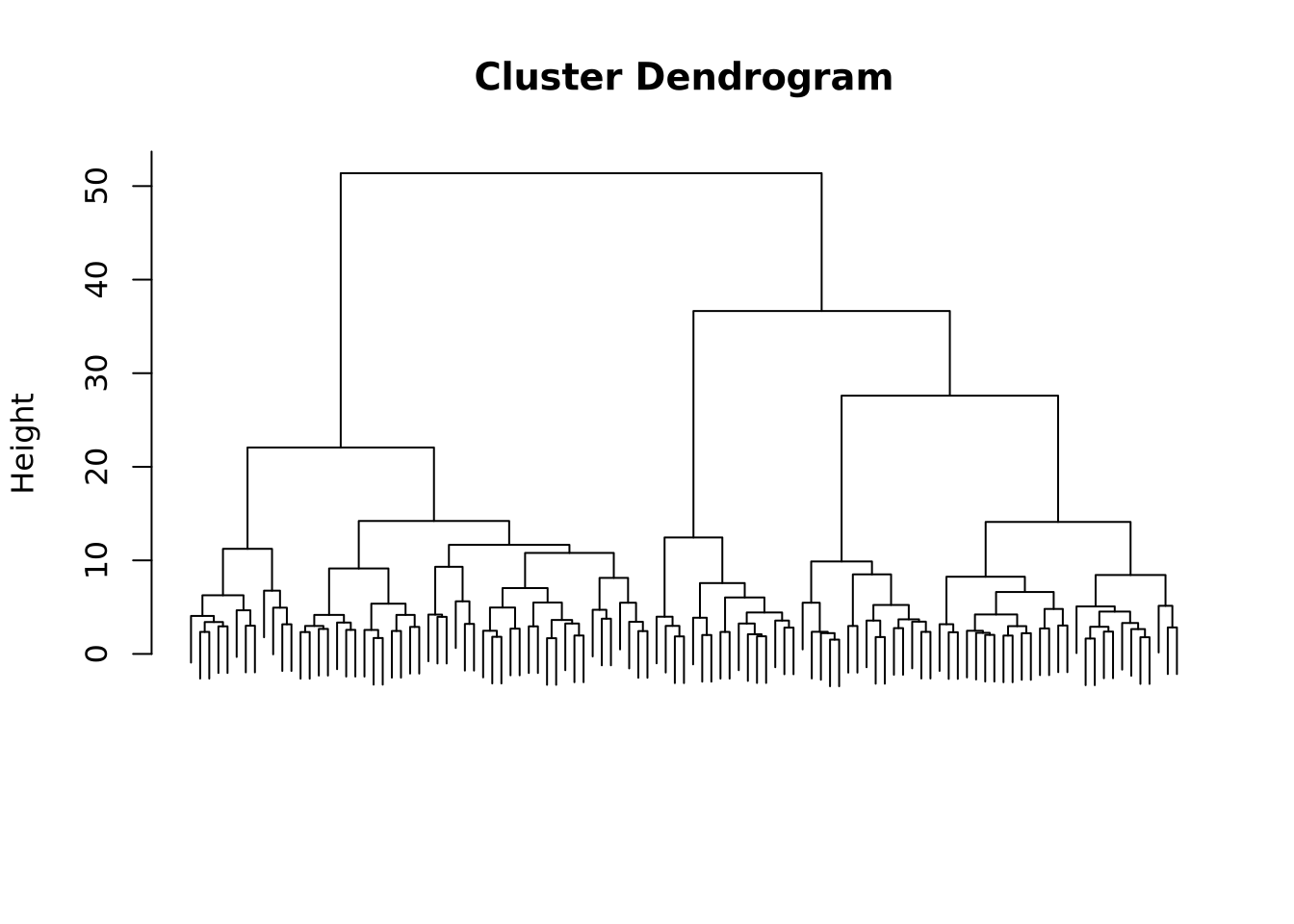
We see that the resulting dendogram presents many subdivisions, going from one cluster containing the whole dataset to one cluster per entry. Depending on the study, on the properties that one wants to show, the clustering can be stopped at a selected level.
Choosing the optimal number of clusters
To determine the optimal number of clusters we will use the factoextra package function fviz_nbclust(). Before fine-tuning the parameters, a theory review is necessary and luckily, the factoextra documentation provides a handy explanation.
The elbow method
We will first use the elbow method which sets the within-cluster sum of square (WSS), in other words the compacity of the cluster, against the number of clusters. By plotting this, we aim to find a bend that corresponds to a minor decrease of the WSS meaning the compacity doesn’t improve much beyond a certain number of clusters.
Code
# Choose FUNcluster depending on the type of clustering you want to perform,
# here hcut corresponds to hierarchical clustering
fviz_nbclust(scaled_x, method = "wss", FUNcluster = hcut)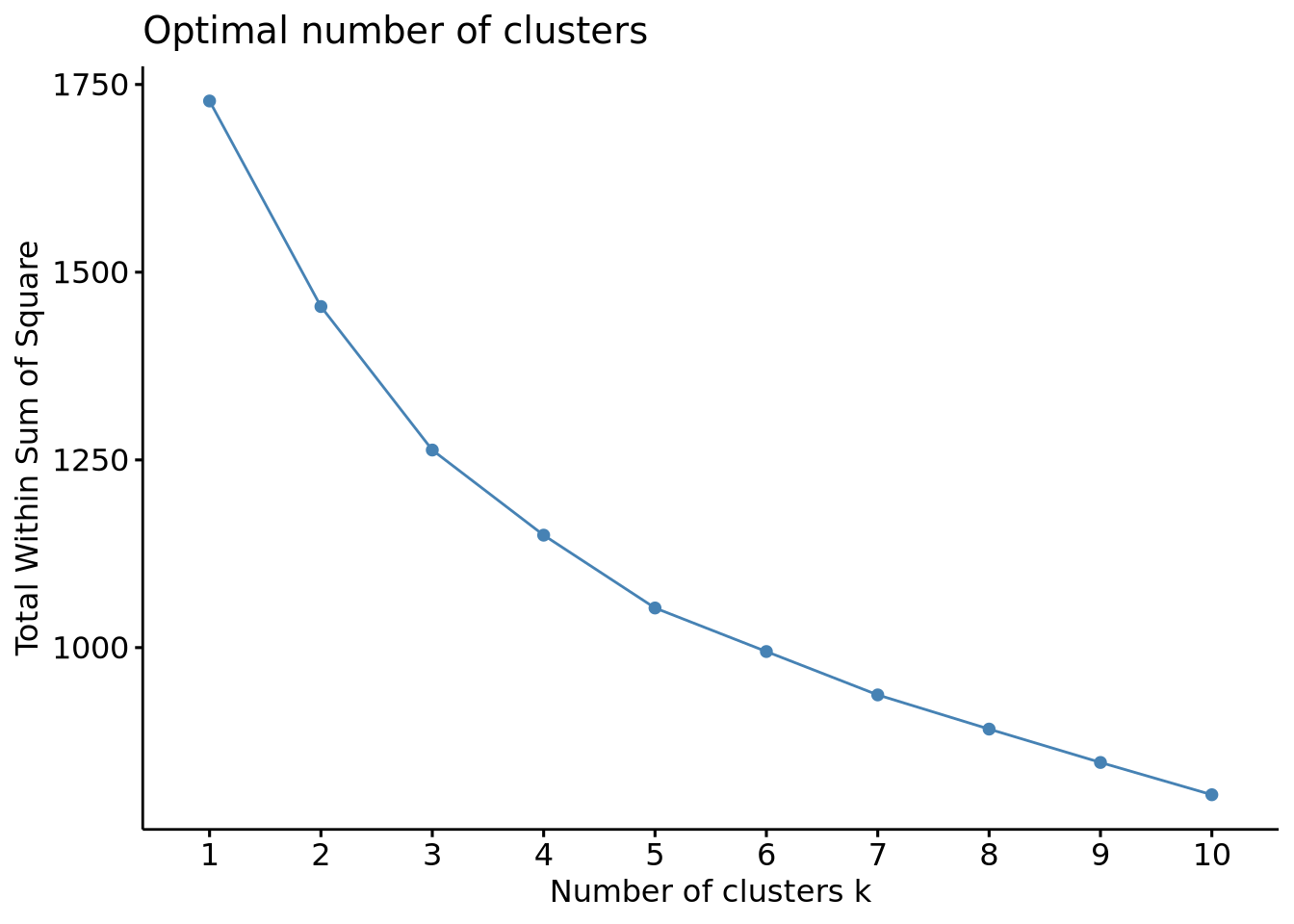
In the generated plot, we do not a see proper bending, meaning that the elbow method couldn’t provide an optimized criterion to choose the optimal number of clusters. We can estimate an optimal number of clusters between 3 and 5 but testing other methods will be necessary to ensure it.
The silhouette method
This method measures the quality of the clustering by assessing how well an object fit into its assigned cluster. It calculates a silhouette coefficient which is the difference between the inter-cluster distance and the intra-cluster distance, higher values indicating a good clustering and therefore the optimal number of clusters.
Code
# Optimal number of clusters using the silhouette method
fviz_nbclust(scaled_x, method = "silhouette", FUNcluster = hcut)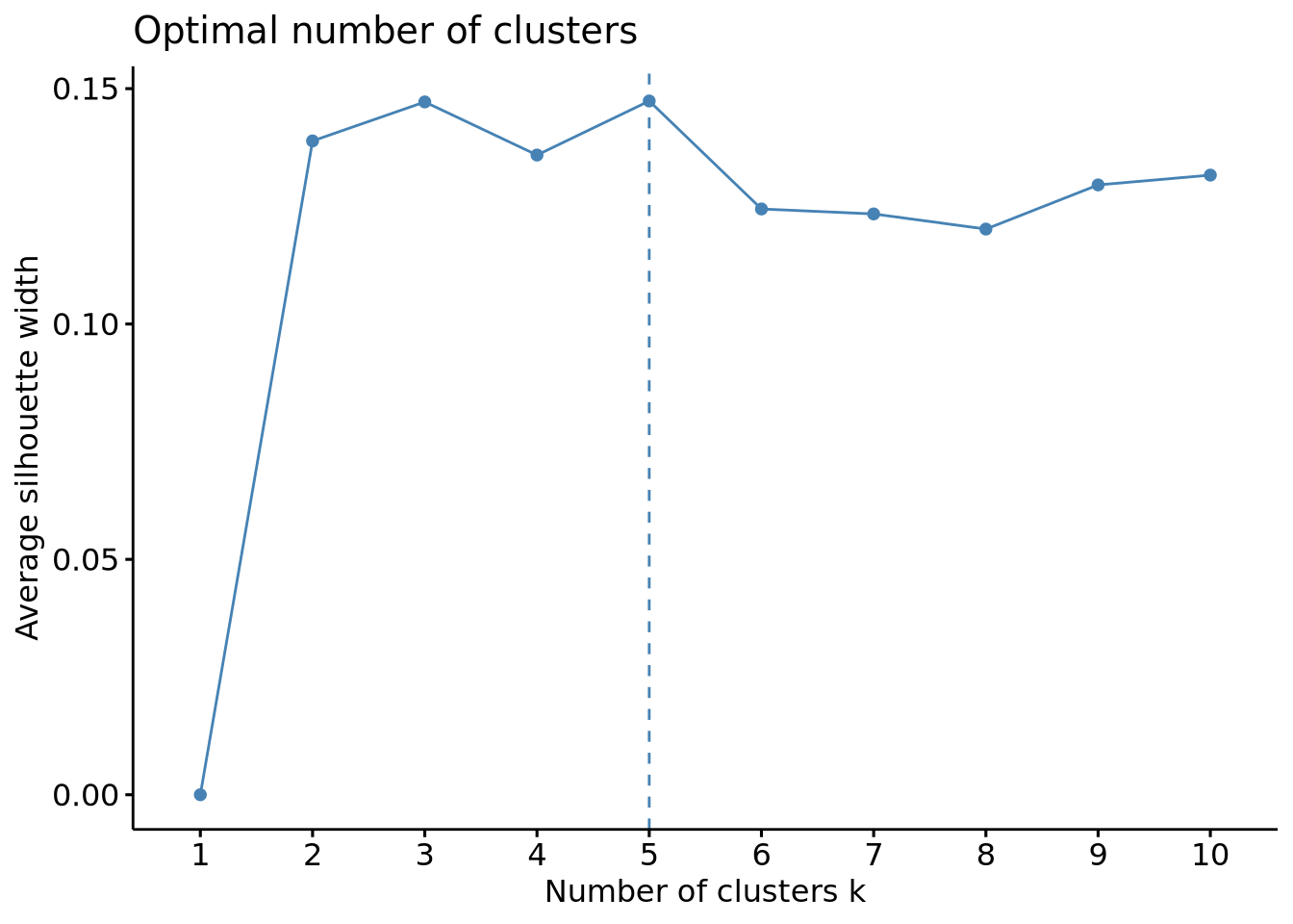
This method gave us more usable results, indicating an optimal number of clusters of 3 or 5, which is in line with the results obtained above. Another validation would be usefull to ensure 3 and 5 are really the optimal number of clusters and luckily, another method can be used with this package: the gap method.
The gap method
This method determines the optimal number of clusters in a dataset by comparing the within-cluster dispersion of the dataset to a reference uniform distribution. For each \(k\), a gap representing the distance of the cluster to the reference is calculated, higher values indicating that the clustering structure is far from a random distribution fo points.
Code
# Optimal number of clusters using the gap method
fviz_nbclust(scaled_x, method = "gap_stat", FUNcluster = hcut)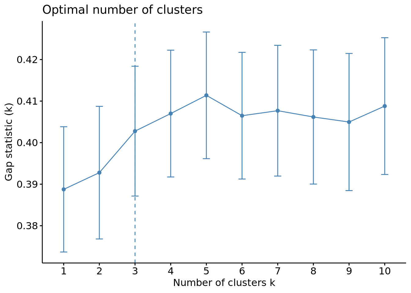
We can see this time that the optimal number of clusters is of 3.
Comparison of the methods and choice for our dataset
While the elbow method gives the optimal number of clusters through a visual inspection of the plot, which can be subjective, the silhouette and the gap methods give more quantitative results thus being more objective and more reliable.
These two last showed that the optimal number of clusters is either 3 or 5, the results being very similar. The choice now depends on the dataset and the relevance to produce more clusters or not. Our goal being determining the druggability of protein pockets, it might not be necessary to split the dataset into many clusters as the properties of those cavities might not highly differ in general so we will continue with an optimal number of cluster of 3.
Retrieving the clusters
We can now see visualize our clusters in the dendogram.
Code
# Visualization of the clusters in the dendogram
plot(x_classif, labels = FALSE)
rect.hclust(x_classif, k = 3)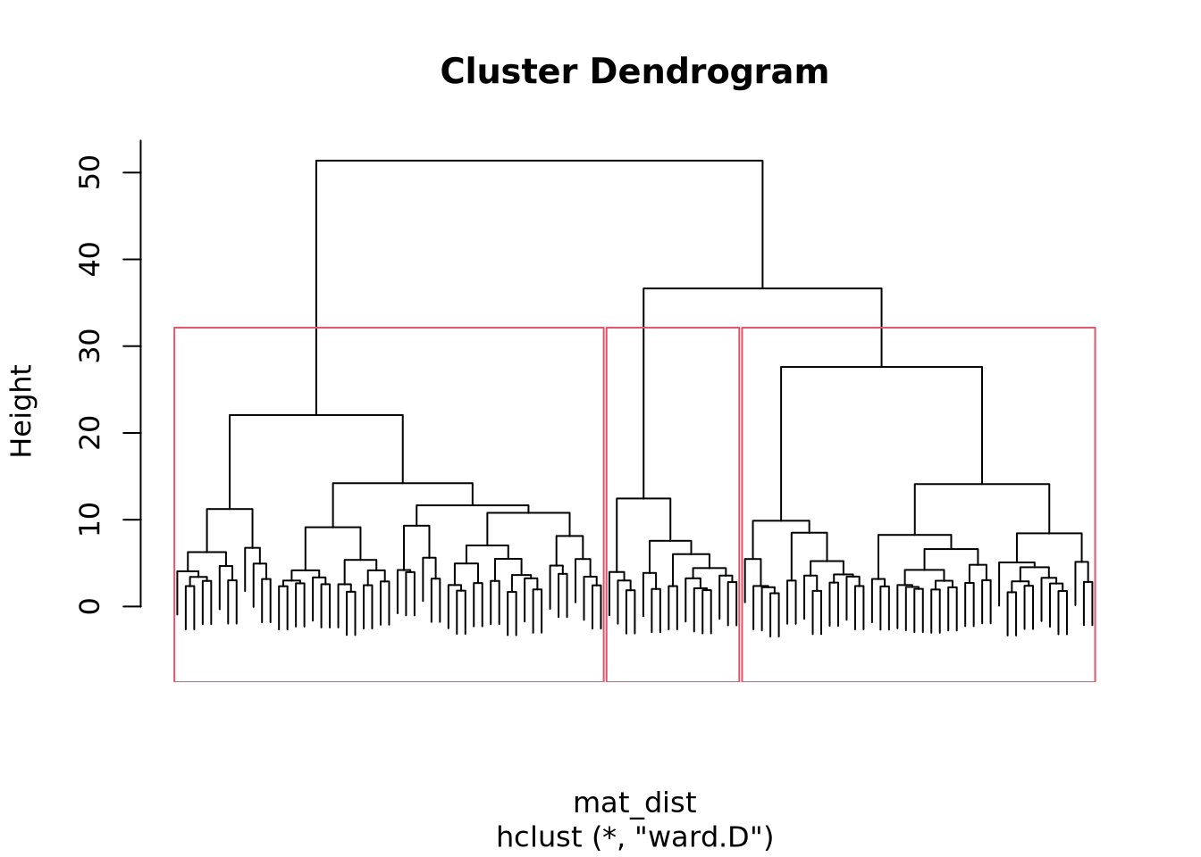
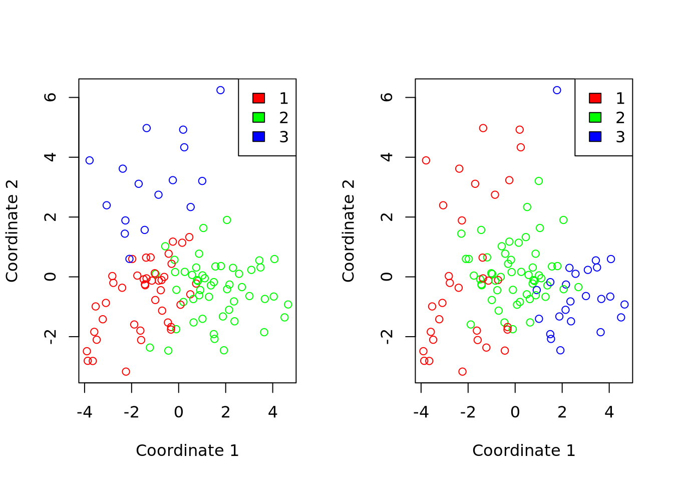
We can also plot our clusters either by performing a Multidimensional Scaling (MDS) or by using fviz_cluster() the dedicated function of the factoextra package.
Code
# Retrieval of the clusters
cluster_cut <- cutree(x_classif, k = 3)

# Multidimensional scaling
mds <- cmdscale(mat_dist)
df <- data.frame(mds, cluster = factor(cluster_cut))
colors <- rainbow(length(unique(df$cluster)))

plot(df$X1, df$X2,
  col = colors[df$cluster], xlab = "Coordinate 1",
  ylab = "Coordinate 2", main = "Multidimensional Scaling Plot"
)
legend("topright", legend = levels(df$cluster), fill = colors)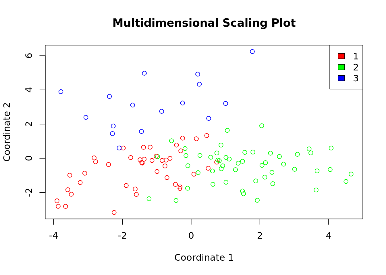
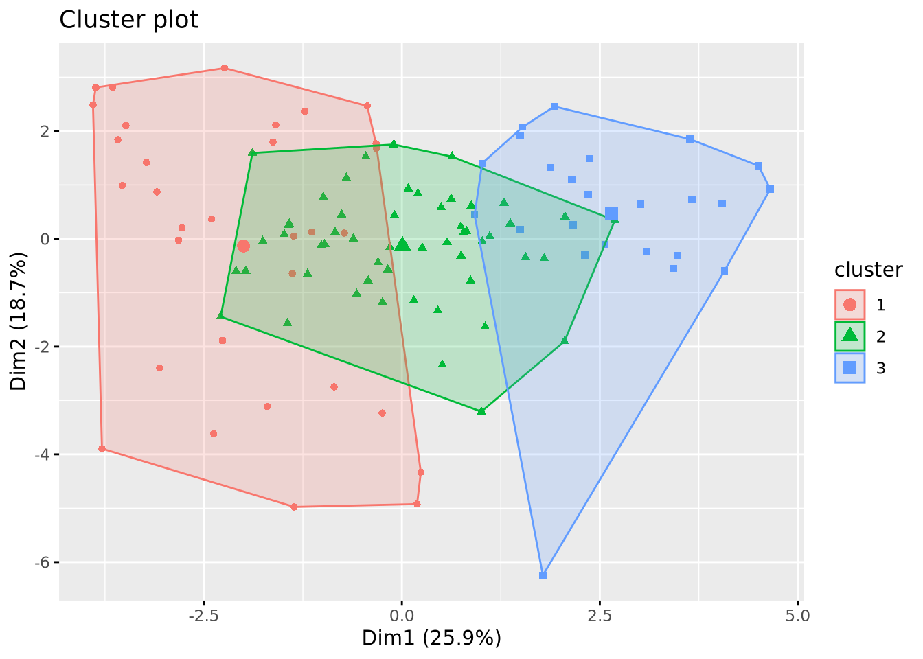
Code
# Visualization of the clusters
fviz_cluster(list(data = X, cluster = cluster_cut), geom = "point")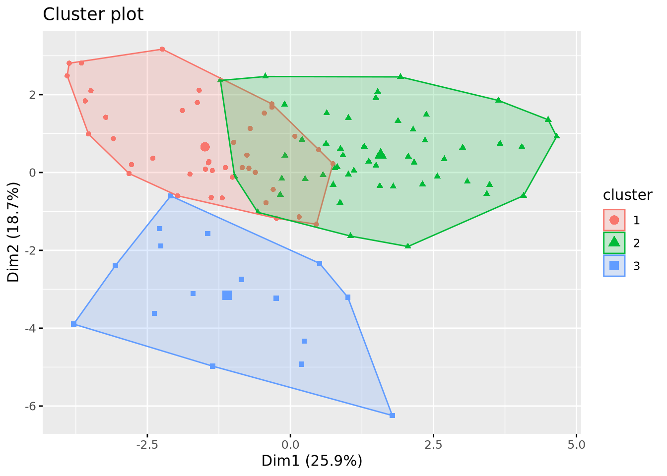
K-means
This classification method aims to produce clusters with a minimial WSS. This is achieved through a process that can be broken down into 5 steps:
- Random selection of a number of \(k\) points as initial centroid clusters.
- Assignment of the remaining points to the closest cluster (e.g. using the Euclidian distance)
- Update of the centroids with the new set of points in each cluster.
- Reassignment of the other points with the updated centroids.
- Repeat update and reassignment until no significant centroids change or predefined number of iteration steps is reached.
To begin with, We will be using the base R function kmeans() on out calculated matrix of distance. Note that the results generated by k-means are sensitive to the random starting assignment.
Code
# Clustering using th k-means method
km_res <- kmeans(mat_dist, centers = 5)

# Ploting the results
fviz_cluster(km_res, X, geom = "point", ellipse.type = "convex", ggtheme = theme_gray())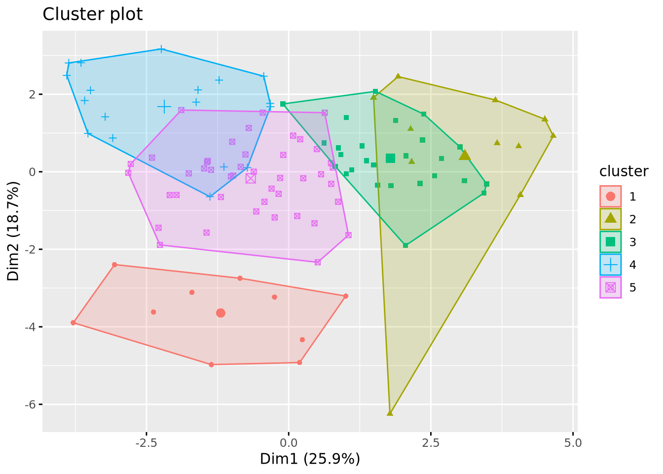
This example generated 10 clusters as we specified with the center argument, but two things still need to be adjusted:
- Correct the impact of the random starting assignment.
- Determine the optimal number of clusters as we did for the hierarchical classification.
Correcting the randomness
In the kmeans() function, we can set the nstart argument which allows you to choose the number of random sets of centers to be tested. If we take nstart = 1, only one random set of centers will be tested. This will generate different clusters between two realizations of kmeans. If we take nstart = 50, 50 different sets will be tested. In this way, the results will converge towards the same clusters, guaranteeing reproducible results between two iterations. A balance needs to be struck depending on the size of the dataset: for a small dataset like ours, nstart = 50 could be too high.
We tested nstart values going from 1 to 50 to see how the composition of our clusters is affected.
Code
km_res_1 <- kmeans(mat_dist, centers = 10, nstart = 1)
sort(table(km_res_1$cluster))

km_res_5 <- kmeans(mat_dist, centers = 10, nstart = 5)
sort(table(km_res_5$cluster))

km_res_10 <- kmeans(mat_dist, centers = 10, nstart = 10)
sort(table(km_res_10$cluster))

km_res_25 <- kmeans(mat_dist, centers = 10, nstart = 25)
sort(table(km_res_25$cluster))

km_res_50 <- kmeans(mat_dist, centers = 10, nstart = 50)
sort(table(km_res_50$cluster))
 9  1  2  6  3  4  7  5 10  8
 3  6  7  7  8 11 15 17 17 18

 6  9  4 10  3  5  2  1  8  7
 5  5  6  6  8 10 11 15 19 24

 2  4  5  1  8  6 10  9  7  3
 5  6  6  8  9 10 10 17 18 20

 3  5 10  4  6  9  7  1  2  8
 5  6  7  8  8  9 13 14 18 21

 2  4  5  7  9  6 10  3  8  1
 5  5  6  6  8 10 11 15 19 24
Before analyzing the results, we must keep in mind that increasing the number of clusters increases the degree of randomness. In our case, choosing 10 clusters will be hardly producing identical results for the different tested values. By observing the results we see that the generated clusters have a similar composition, meaning that our dataset is not too sensitive to randomnes, probably because of its small size or its distribution in space. Now if we compare the results with a value of 1 with the others we still see a slight change, meaning the randomness can be corrected. However starting from 10 or 25 we don’t see majors changes, therefore we will continue with a nstart = 25.
Choosing the optimal number of clusters
We used the same protocol as we did with the hierarchical classification.
Code
fviz_nbclust(scaled_x, FUN = kmeans, method = "wss")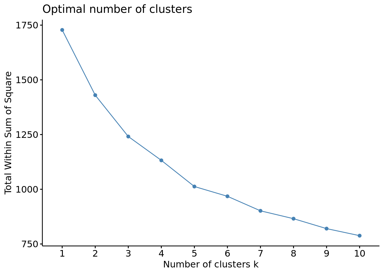
Code
fviz_nbclust(scaled_x, FUN = kmeans, method = "silhouette")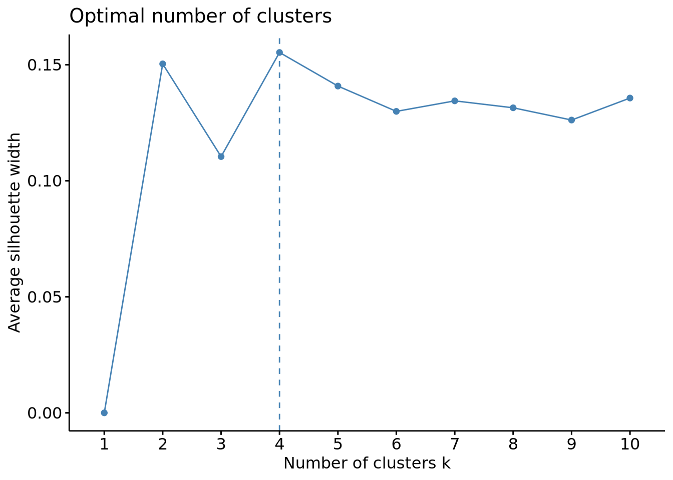
Code
fviz_nbclust(scaled_x, FUN = kmeans, method = "gap_stat")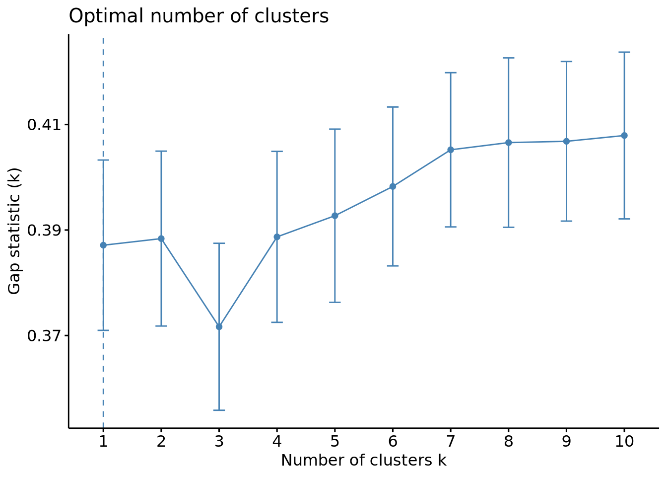
The wss plot seems to indicate 3 or 5, the silhouette 4 and the gap-stat 1. Since the latter has a similar gap value for a number of 4 clusters, we set the optimal number of clusters to 4.
We can now plot our clusters:
Code
km_res <- kmeans(mat_dist, centers = 3, nstart = 25)
fviz_cluster(km_res, data = X, geom = "point")
Code
# Multidimensional scaling
df_km <- data.frame(mds, cluster = factor(km_res$cluster))
colors <- rainbow(length(unique(df_km$cluster)))

plot(df_km$X1, df_km$X2,
  col = colors[df_km$cluster], xlab = "Coordinate 1",
  ylab = "Coordinate 2", main = "Multidimensional Scaling Plot"
)
legend("topright", legend = levels(df_km$cluster), fill = colors)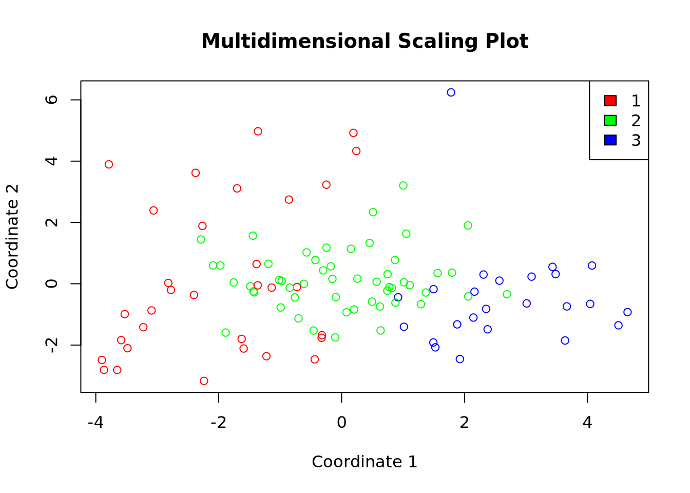
Comparaison of the clustering methods

Classification des descripteurs
Code
mat_cor <- cor(X)
mat_cor_dist <- as.dist(1 - mat_cor**2)
mat_cor_dist_matrix <- as.matrix(mat_cor_dist)

library(gplots)
heatmap.2(mat_cor_dist_matrix, hclustfun = hclust)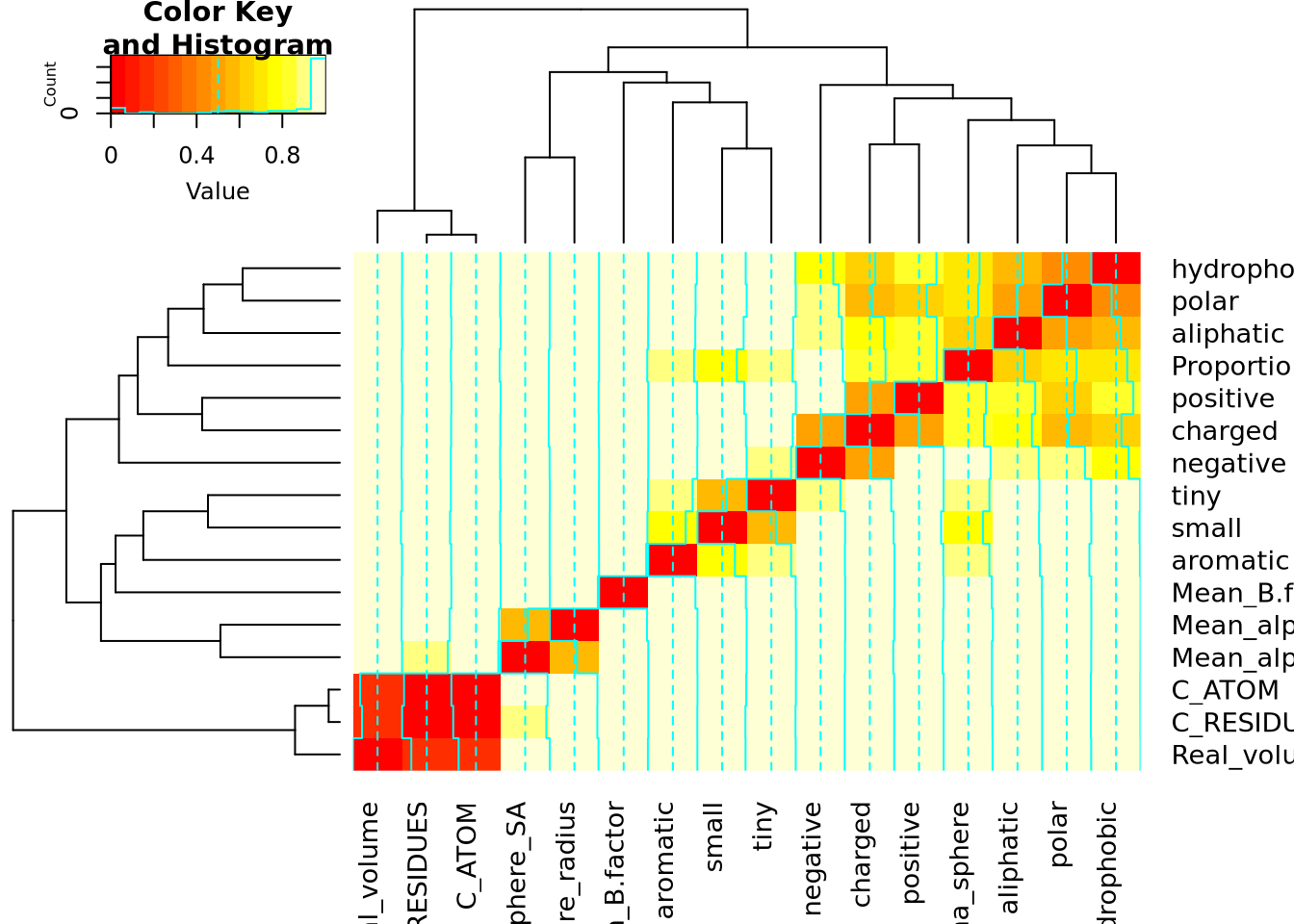
References
[1]
L.B.V. de Amorim, G.D.C. Cavalcanti, R.M.O. Cruz, The choice of scaling technique matters for classification performance, Applied Soft Computing 133 (2023) 109924. https://doi.org/10.1016/j.asoc.2022.109924.
Reuse
CC-BY-SA-4.0
Citation
BibTeX citation:
@online{bari garnier2024,
  author = {Bari Garnier, Martin},
  title = {Data {Classification}},
  date = {2024-02-26},
  url = {https://MartinBaGar.github.io/Master_ISDD_fiches//mda/pages/tp1.html},
  langid = {en}
}
For attribution, please cite this work as:
M.
Bari Garnier, Data Classification, (2024). https://MartinBaGar.github.io/Master_ISDD_fiches//mda/pages/tp1.html.